Novartis was 6 months behind on launching the first .com site for the US. The vendor only had high fidelity mockups and was not able to produce a viable website. At this point, the design and technology was over a year old and they scrapped the project. We (eyeC Systems inc.) were invited to bid on an entirely new design and roll out but in a 3 month time frame, based on work we had done for merck.com. We were awarded the job in one week and went on to successfully launch in 3 months.
The Need
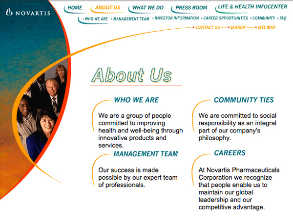
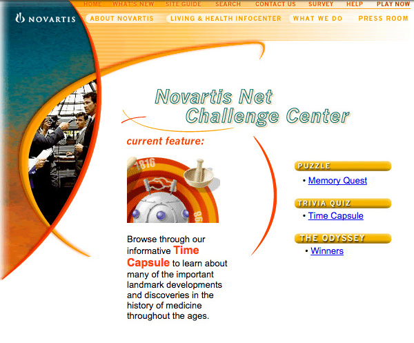
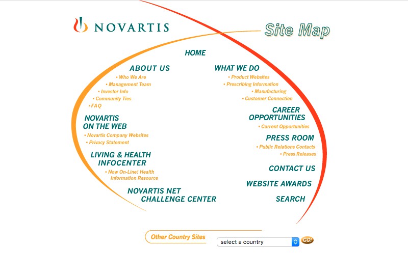
Design Novartis US Pharma corporate portal with access to product information but with a focus on health and research. Architect new flow for existing content to be scaleable for new content and features. Develop web guidelines, standards, and processes for publishers.
Novartis Case Study
Need
Design corporate portal
Architect new content flow
Develop web guidelines, standards and processes for publishers.
Pain points:
Little internet presence, no continuity
Publishers with conflicting messaging
No digital experience or interaction with Novartis as a Brand (vs. Product DTC)
Concerns:
Quality not sacrificed with short timeline
Should be intuitive and simple to use, but scaleable
Graphics vs. speed of page load
Must Haves:
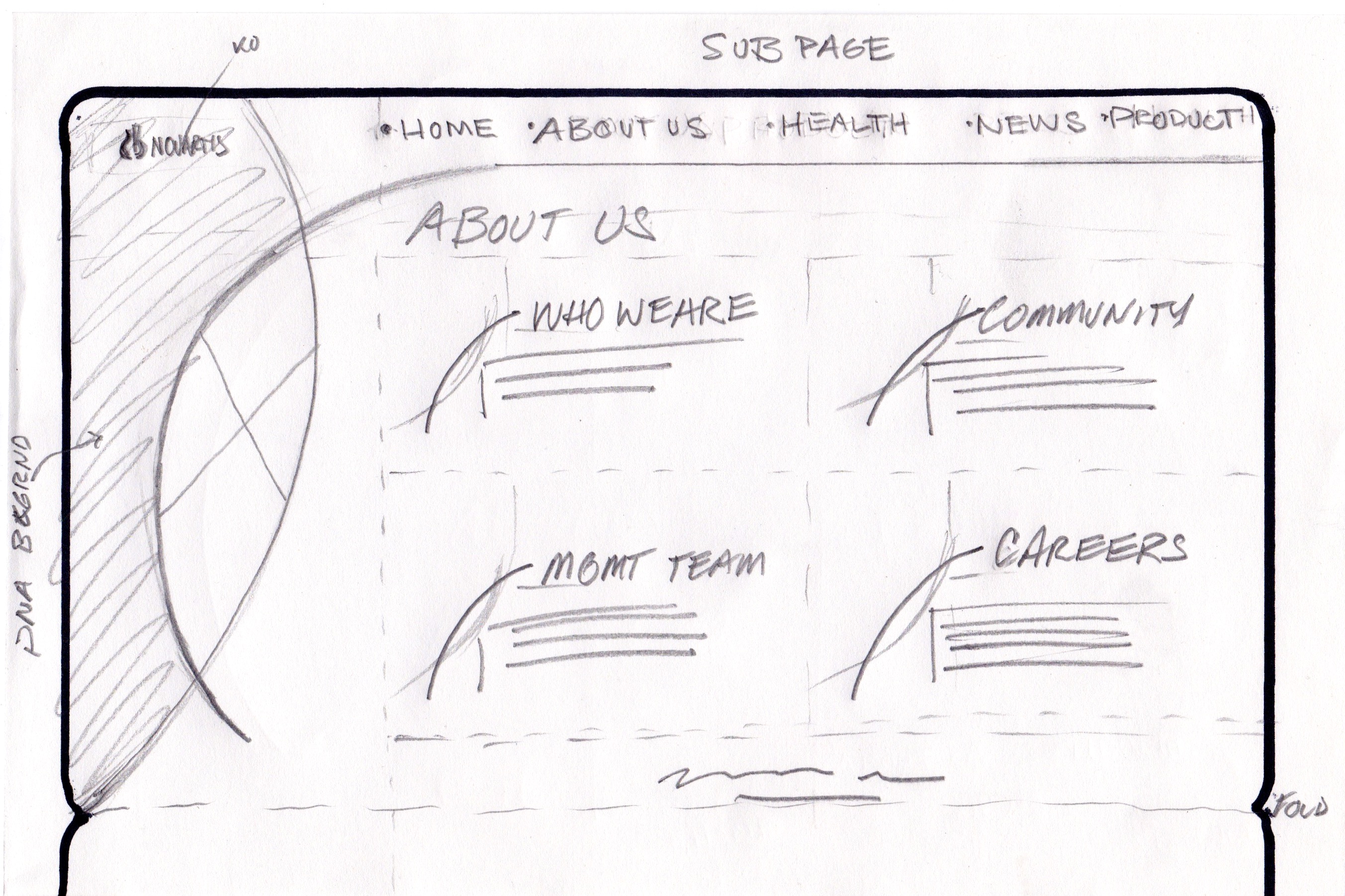
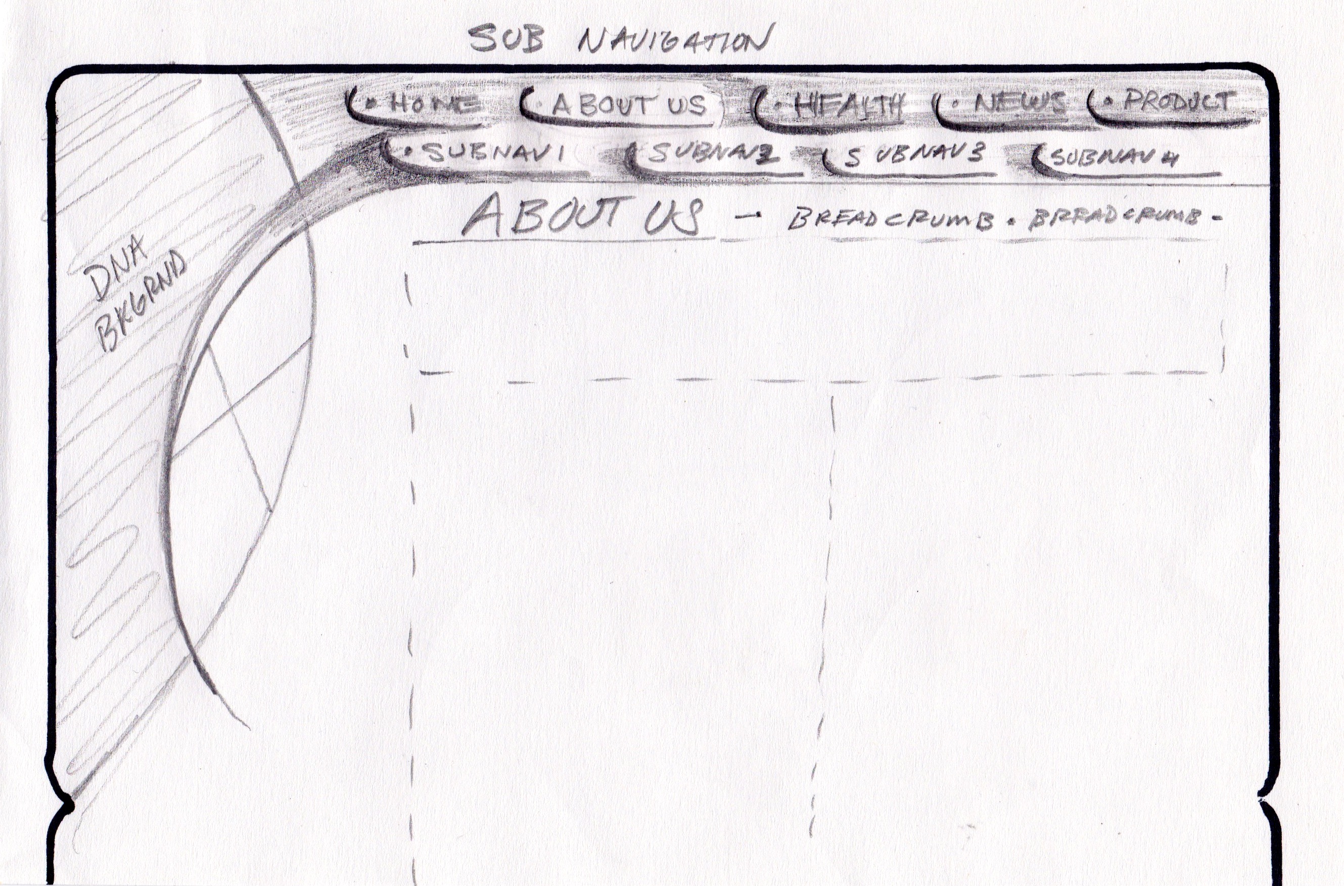
Easy to navigate, breadcrumbs
Single point of contact for web inquiries
Web publishing standards and guidelines
Would-Be Nice:
Ask Jeeves search tool
Verify US audience for product information
Set the standard for Novartis Global internet presence
Research: Used advanced sites spacejam.com, myspace.com, xanga.com and of course ibm.com to pattern ease of use and architecture. Little time to interview stakeholders (product mgmt, board members, legal, medical, marketing and IT), instead we used online forms to gather consensus.
Insights: Business units would like a publishing tool. Content management solution will work for most publishers except the product. Product teams want publishing guidelines and need a faster way to publish product information. Product sites will be responsible for individual product sites, can not be on the corporate portal. The Board just wants everything done yesterday. Users want to have the information they can trust and be able to recommend to friends and family.
Empathy
Trust in Big Pharma Co. not the greatest
Concerned about accurate product and health information
Frustrated by conflicting information
Interactions
Intuitive and simple use
Works without fail
Prompt feed back (automated?)
Experience
Trust in the product and company
Accurate timely information
New health lesson learned
Journey
Open channel for communication
Satisfaction with digital interactions
Trusted health source
Ideation
3 concepts
1 Proof of concept
User testing Hi Fidelity mock ups
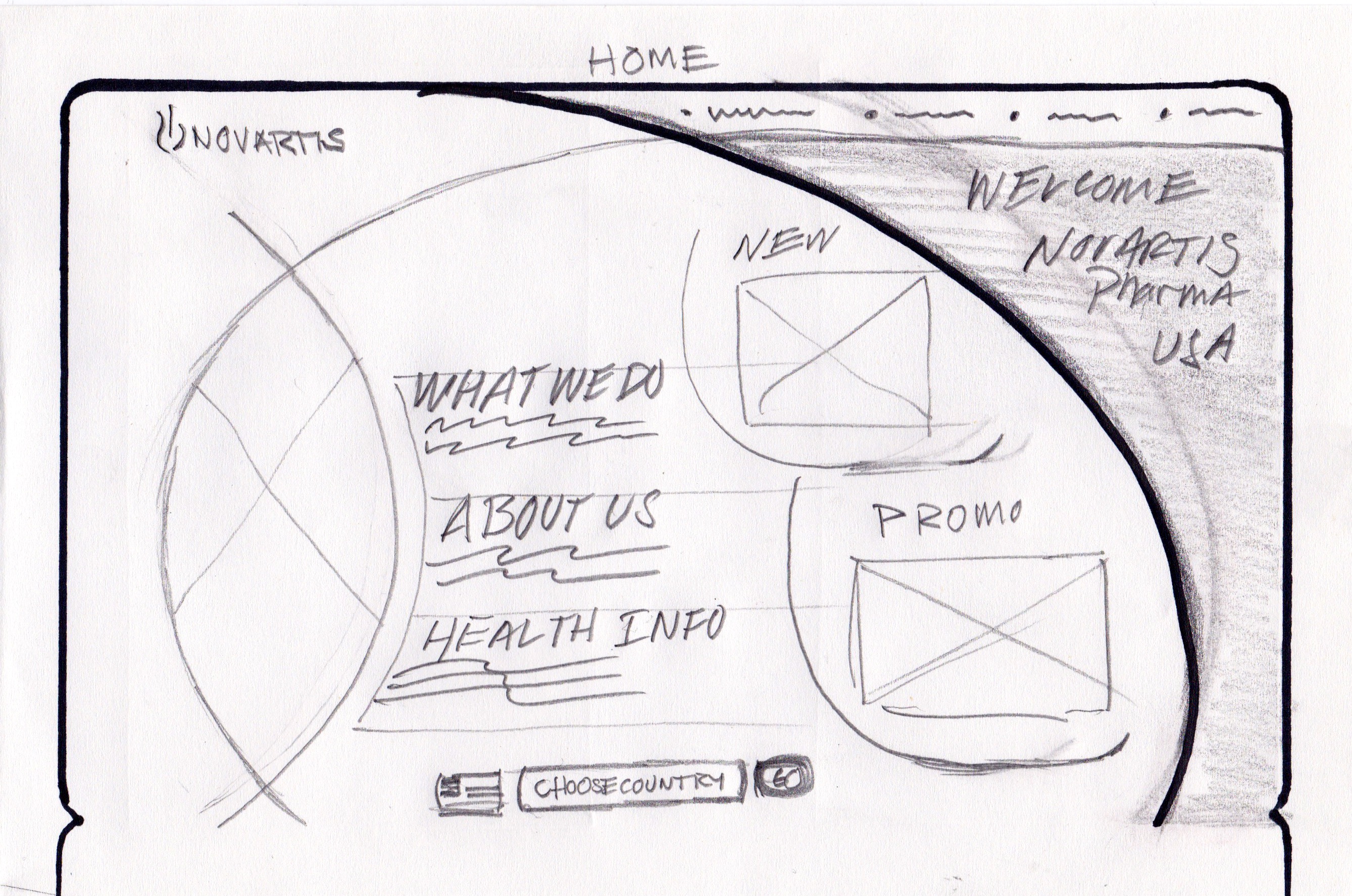
Story Boarding-Wire Frames:
Learned people desire health info before product info
Content is now more credible with professional topics
Users don't want to have to click more than 3-5 times for desired information
Design Critique:
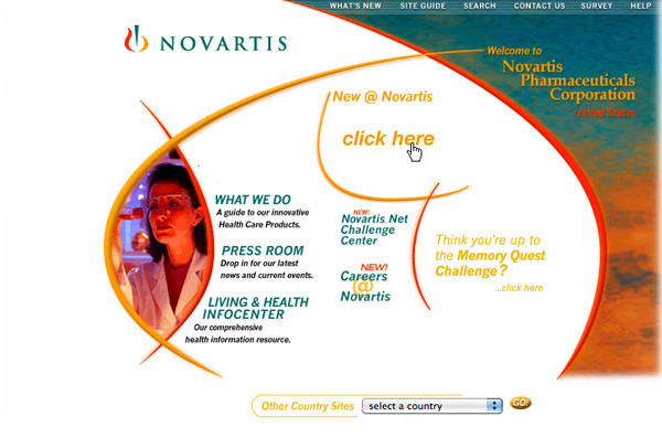
Progressive colors not typical of big co. feels cutting edge
Mixes well with branding and messaging
More simplistic navigation verbiage
Prototype/User Testing:
Learned bright colors work better
Keep consistent top nav don't color break
3d buttons illustrate click-ability
Conclusions:
Muted colors work better
Menu clickable
Results:
2.0 Site launched on-time, in 3 months with version 2.1 in another 3 months
Site won the eHealthCare award for “Most Innovative Site” mainly for visual design and navigation
Delivered a consistent Brand look and feel to all Novartis US publishers
What
Using technology and design to simplify the chaos into a compelling journey