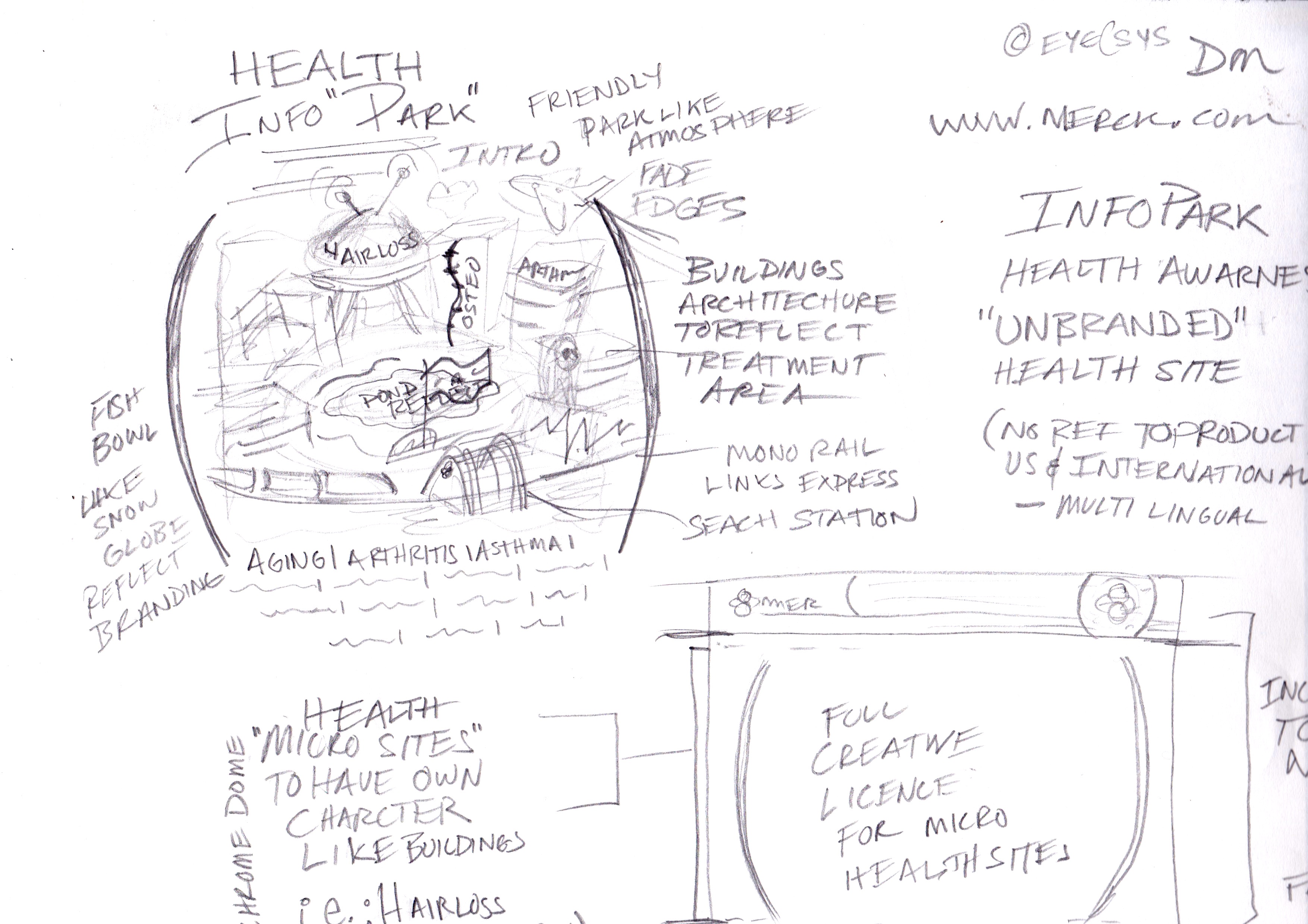
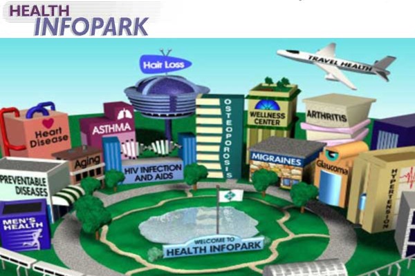
Health Info Park
Merck.com is a global pharmaceutical entity that can not publish world-wide product information, what once was a problem now is a solution. Health Info Park is a way to publish health information for each therapeutic area (i.e., Heart Disease, Asthma, Hairloss, etc.) Health Info Park turned out to be a credible place for health information.
Corporate Portal
While at Merck in one of my many charges as Managing Editor of merck.com, publishers came to me with a need for a faster, easier way to publish to the web with their rigorous and lengthy approval process. I researched enterprise CMS’s before deciding at that point, we needed a complete re-design merck.com from a static site to a more scalable and interactive site. Also, our current search feature functioned poorly and needed a more relevant usable search feature.
Merck Case Study
Needs:
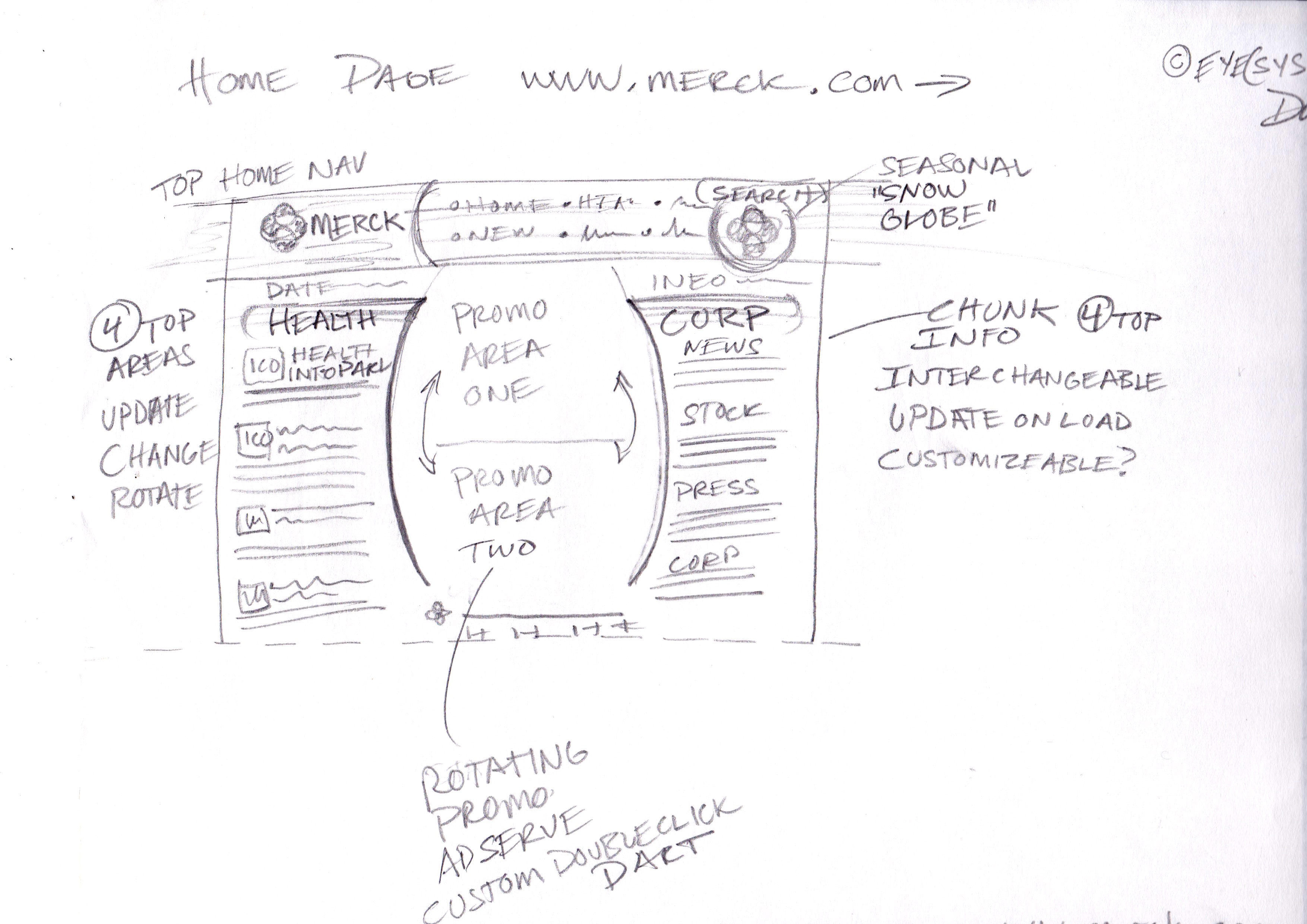
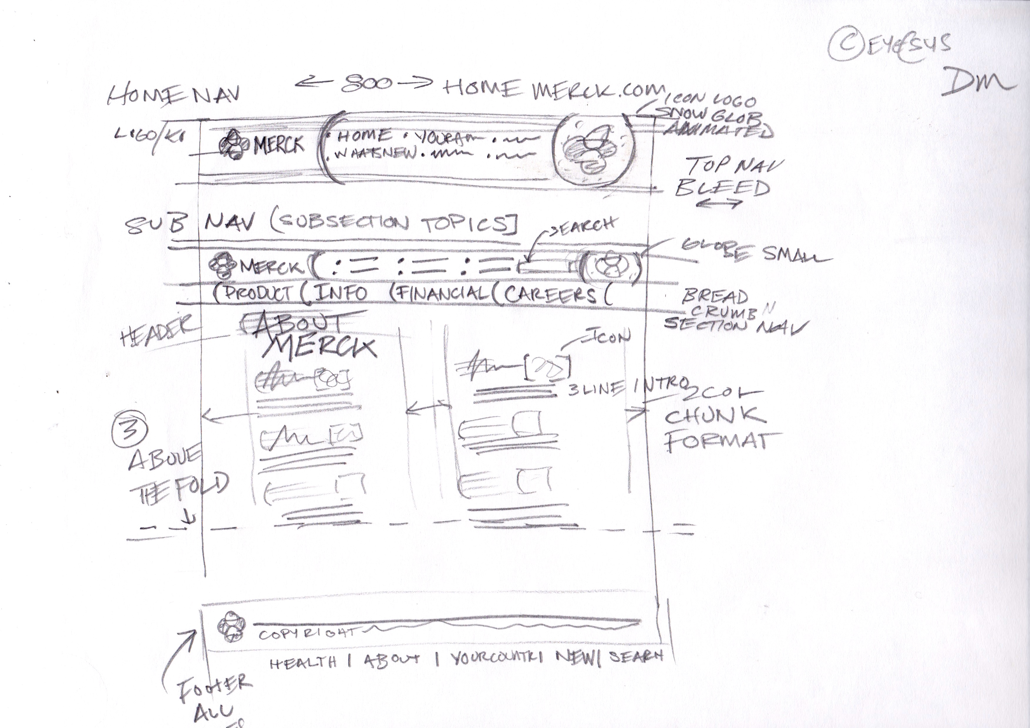
- Complete redesign look and feel and make more interactive
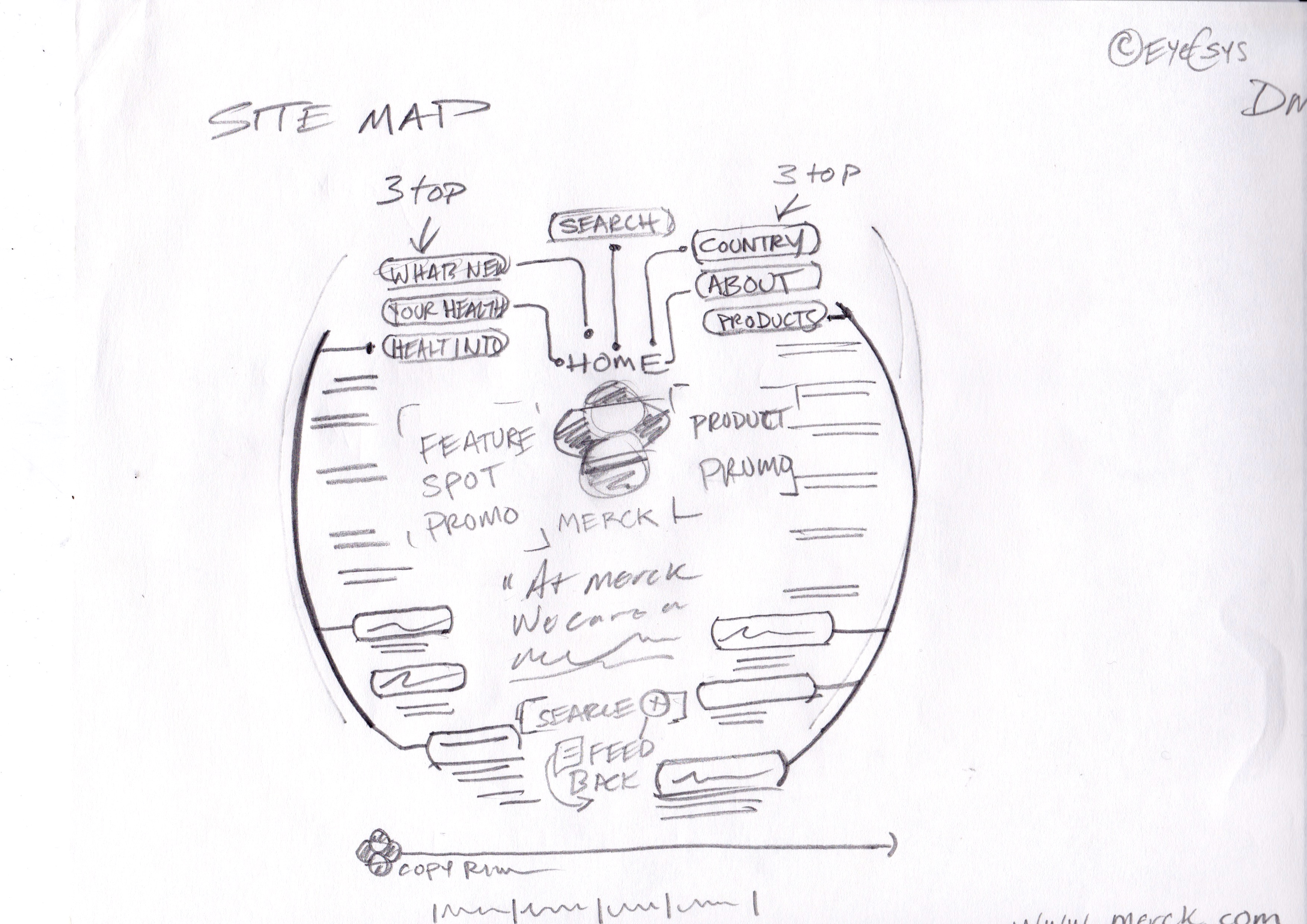
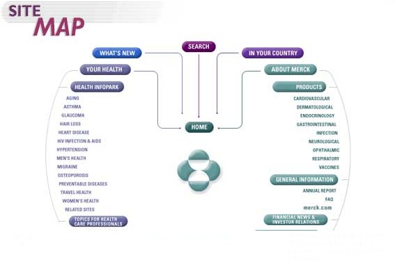
- Scaleable navigation to handle new publishers and expected growth of content
- Business groups publish to the Internet with CMS
- Add Health Info Area to support Merck’s therapeutic areas (non-product info)
- Search feature more relevant and usable
Pain points:
- 10,000 pages hard-coded navigation
- Stacked Navigation difficult to use
- Publishers with conflicting messaging
Concerns:
- The internet is a fad
- Security of data
- Graphics vs. speed of page load
Must Haves:
- Interactive Features
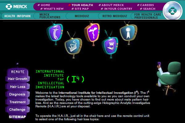
- Health Micro Sites
- Web publishing standards and guidelines
Would Be Nice:
- Functional and relevant search
- Verify location to serve relevant content
- Online community feature
My Role:
- Research
- UI Design
- User Experience methodology
Research: Used advanced sites bloomberg.com, myspace.com, wired.com to pattern ease of use and architecture. Interviewed stakeholders for 2 months (product mgmt, board members, legal, medical, marketing and IT). We were also able to Interview a pool of Doctors and other Health Care Professionals. The consumer interviews were done by outside agency.
Personas: The primary focus is on John Q. Public the consumer, while on professional sites the emphasis is on Dr.’s and Health Care Professionals. This splits the content direction into 2 buckets technical and novice. One of the public personas wanted to also see what the Dr. sees so we added a feature like “read more” to view more technical info on the subject.
Insights: Merck wants to be seen as a caring-wellness and progressive research entity. Business units would like a publishing tool that also tracks the necessary review and approval process. Product wants to publish health topics by therapeutic area. Health Care professionals would like to see a community feature. Users want to have information they can trust and be entertained while being able to recommend to friends and family.
Mapping
Empathy
- Trust in is not the greatest
- Information should be accurate and timely
- Opinions are everywhere
Interactions
- Intuitive and simple use
- Works without fail
- Prompt feed back cues
- Not gimmicky
Experience
- Trust in the product and company
- Accurate timely information
- New health lesson learned
Journey
- Open channel for communication
- Satisfaction with digital interactions
- Trusted health source
Ideation
- 3 concepts
- 1 Proof of concept
- User testing Hi Fidelity mock ups
Story Boarding-Wire Frames:
- Learned people desire health info before product info
- Content is now more credible with professional topics
- Users don't want to have to click more than 3-5 times for desired information
Design Critique:
- Progressive colors not typical of big co. feels cutting edge
- Mixes well with branding and messaging
- More simplistic navigation verbiage
Prototype/User Testing:
- Learned bright colors work better
- Keep consistent top nav don't color break
- 3d buttons illustrate click-ability
Conclusions: The redesign went smoothly. The content management piece proved the most difficult with customizing the approval process involving legal and medical changes and maybe a sign off. The user testing went well users were generally happy. The individual health sites went well with the normal hiccups. Overall it was a positive experience had by all.
Results:
- 2.0 Site launched on-time, in 1 year with updates planned every 3 months
- Business units now have a publishing tool to the Internet
- Ask Jeeves search much more relevant and useful
Awards:
- Financial Times: "Best Use of a Company Website"
- MMA-In-Awe Awards: Health Info-park
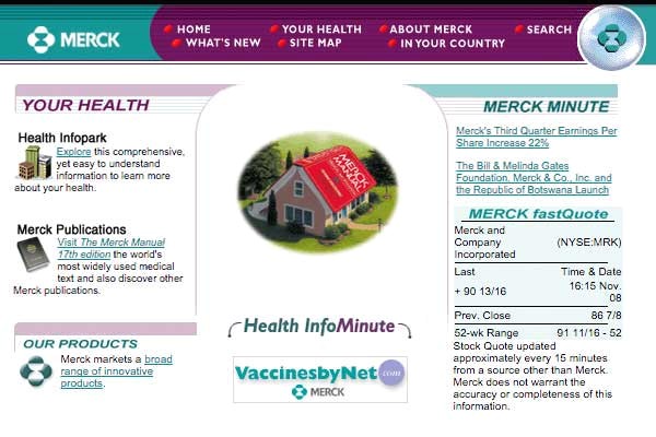
- mostly for the About Merck section and the Stock ticker on the home page
- mostly for the awesome unbranded health content that was a huge hit